Team Sztanyo Logo Feedback
Hey! So, I’ve been working on a logo with a designer, and I would love your feedback. Any work like this is realllllly hard for me, so I appreciate you taking a few minutes to get your thoughts!
Let me give some context:
My current logo is the Roebling Bridge. The idea was that I am licensed in Ohio and Kentucky, so I wanted an image that helped people get that and represented Cincinnati. The logo doesn’t quickly speak to “real estate” at all. The “z” looks like a 7 (my mistake). I don’t really like highlighting my “z”. It’s memorable but confusing. It was a logo I did to get up and going in real estate (I really appreciate the designer who helped!), but I didn’t put a whole lot of time and thought into it. Now, it’s time for a refresh.
As I’ve gone through some branding exercises and read Primal Branding, I have narrowed down who my target audience is: families. In particular, people who are trying to build a strong family team and are thinking multigenerational. It’s not that I won’t work with others, but these are the people I know and get because I am this target audience.
So, the new tagline that is rolling out is: “Find your home. Strengthen your family.”
In the tagline, I’m trying to emphasize the “what” and the “why” of how I can serve as a real estate guide.
While working with a designer in my office, in an original brainstorm session, these were some major themes I wanted incorporated were:
- Family
- Team
- Kind / Approachable
- Home
- Strong
- Story
- Roots
- Generations
- Grow
- Vision
- Guide
- Expert
- Trusted
- Faith
We played around with a few different symbol ideas – a dining room table, a tree with roots, etc. And, then we came to this first draft:
First Draft (not using this)
We played with roots underneath, but it looked to much like a scary, broken foundation. We ended up making the trees have the shape of a home to try to incorporate the “team” idea. However, it wasn’t working for me. There was a little too much going on. I thought it looked fairly clean, but a bit too clip arty for my taste. And, no one I showed it to saw the trees as being part of the “family team” idea. This was kind of my designer’s idea. I pushed back.
That brings us to where we are now.
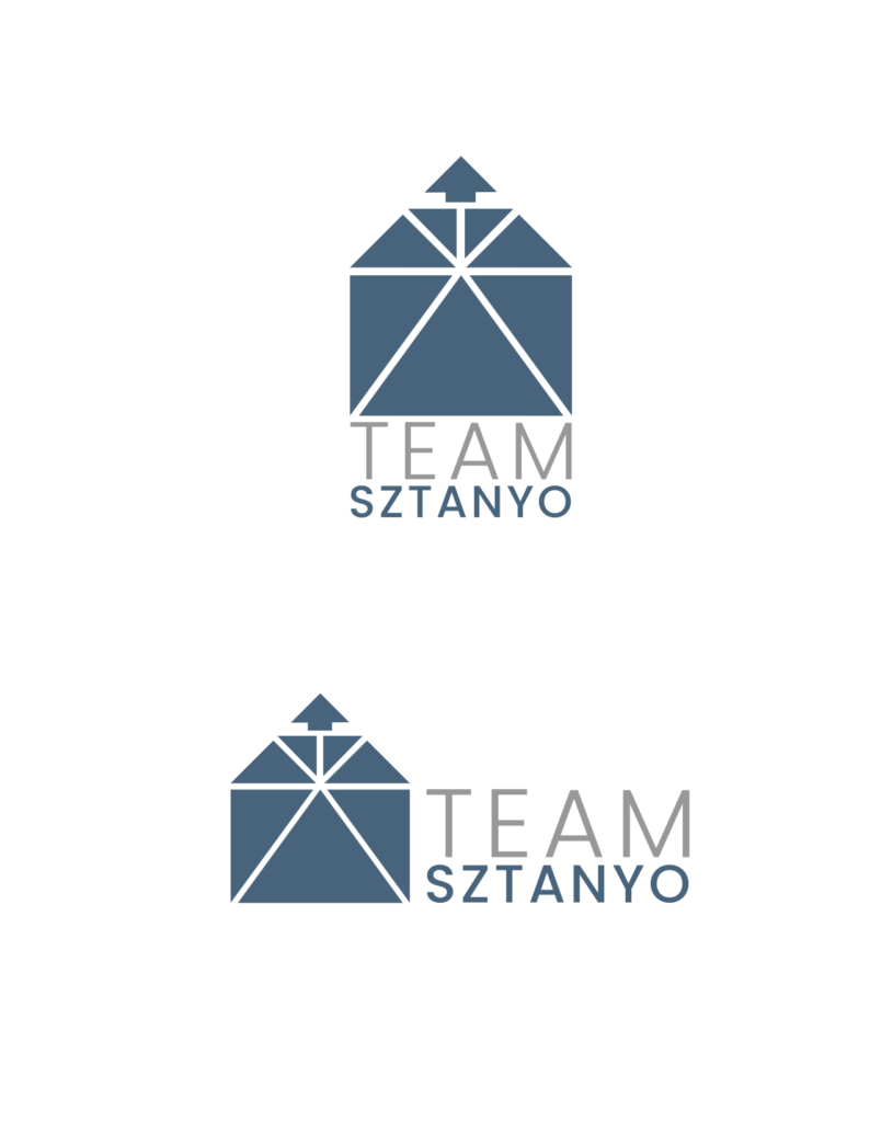
I brainstormed with Witni a bit, and she did some doodles. We focused in on the tagline: Find your home. Strengthen your family. So, first off, we made it a home because someone will instantly get “real estate”. Since “Team Sztanyo” doesn’t necessarily communicate that (and I decided to stick with that name), I like having a home as the primary image. Secondly, we focused on “strong” and “family”. So, the idea is that triangles are the strongest shape. And, the home is made up of multiple members of the “team”, but is one unit.
Next, there is a bit of a faith element involved. If you want to get into further meaning …
The large, center triangle represents our faith as the foundation of the home. The two next largest triangles surrounding are the parents in the home. The kids are on top (our ceiling is their floor). We have 5 kids, so we broke it into 5.
Lastly, with Option 2, I changed one into an arrow. There are two ideas. First, pointing up represents a faith aspect. Second, the idea of a blessed man whose children are “like arrows in the hand of a warrior … blessed is the man who fills his quiver with them! He shall not be put to shame when he speaks with his enemies in the gate.” Psalm 127
I understand that most people will not make those deeper connections, and I’m totally fine with that. However, I like that it does represent more than just your typical stock art real estate logo.
As for color and type font … I think I like it? But, probably not in love with it. My current blue is much more royal blue (I randomly picked, not a designer). My designer picked this blue and the grey, but didn’t really seem to have a reason. I think I like the font. Feels professional, yet approachable to me.
I think I like it … but, I’d love your feedback!
- What are your impressions?
- Is it too busy? Trying to do too much?
- Which option do you prefer? Why?
- Thoughts on type font and location?
- Thoughts on colors?
- If you’ve been a client of mine, do you feel like the logo fits me?
- Other thoughts? Blow it up? Different idea? Don’t hold back!
It’s easy to get stuck in a process like this. Or, overthink it! Witni keeps telling me it’s not a big deal (and I’m sure she’s right), but I want something that helps tell the story of the brand and that I feel really good about going forward.
Thank you for helping!
Option 1

Option 2